UX/UI DESIGN

Konica Minolta

Konica Minolta, Inc. is a Japanese multinational technology company.

They provide Business Services, Professional and Digital Office Printing, IT Services, Healthcare, Security Services for business.


My responsibilities:

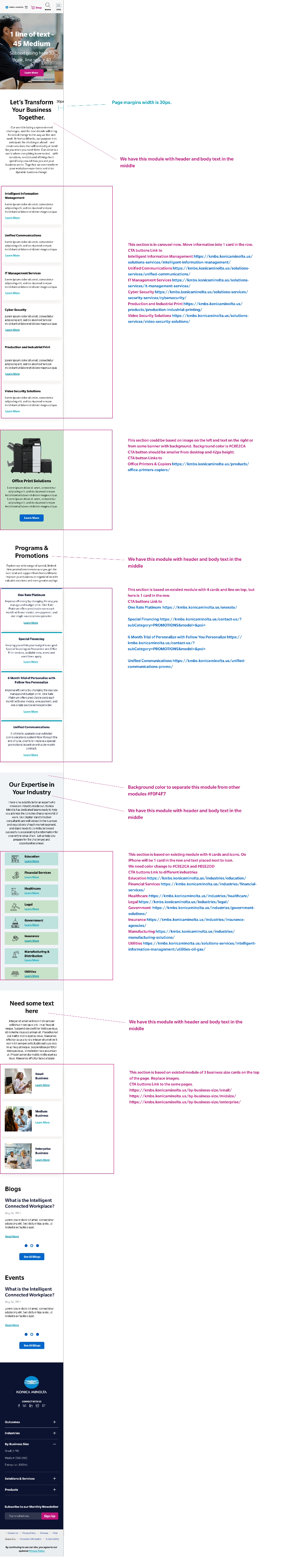
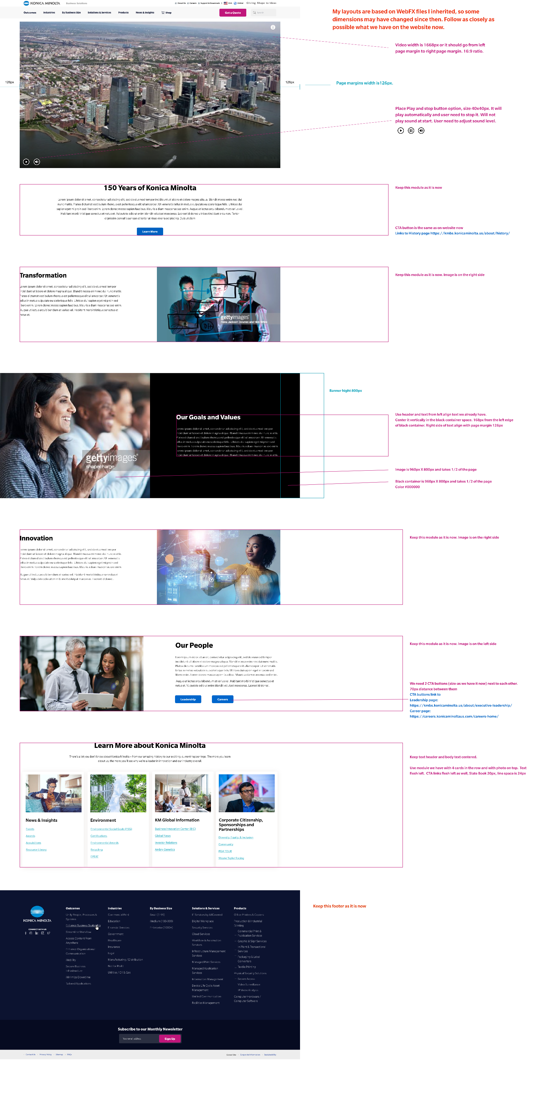
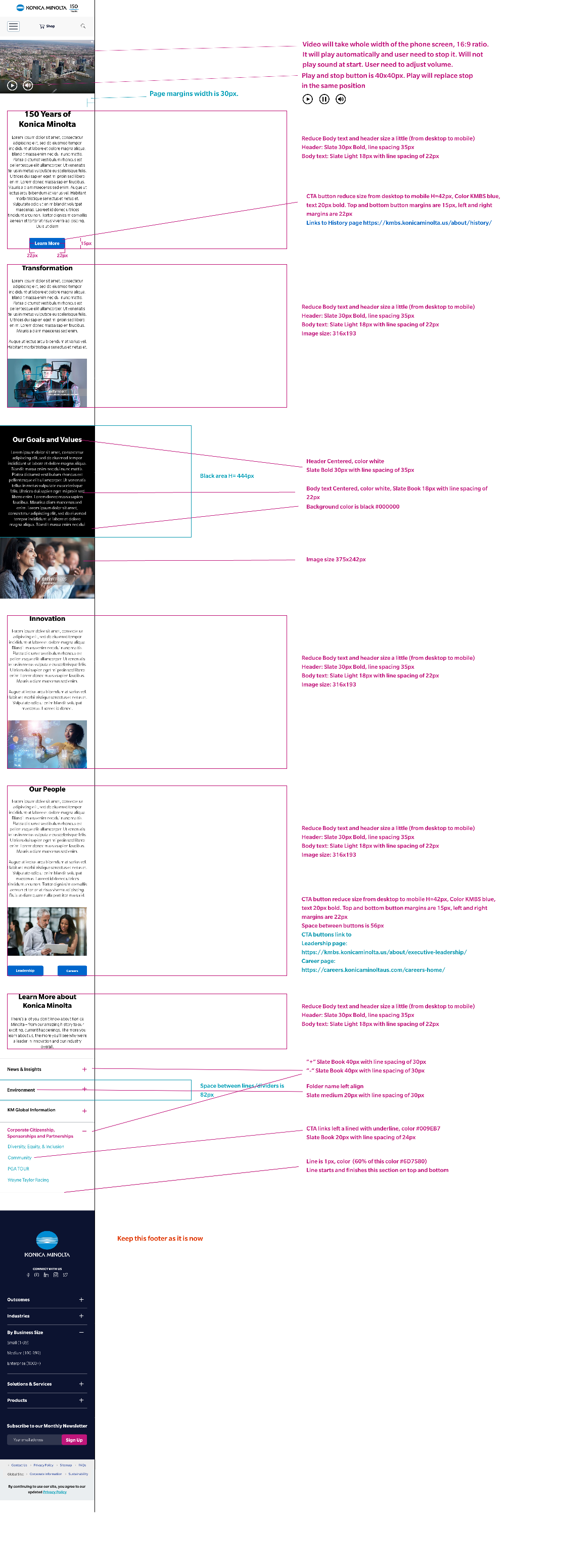
  • Lead, present, manage and collaborate on the redesign of the current large responsive WordPress business website.
  • Provide product and creative direction, suggest new content and offers.
  • Perform competitive analysis and conduct heuristic evaluations to identify necessary improvements and provide feedback.
  • Develop user flows and enhance the overall user experience. Create interactive wireframes and visual mockups.
  • Work closely with various stakeholders, writers, and developers.
  • Populate the website with content and conducting QA testing.
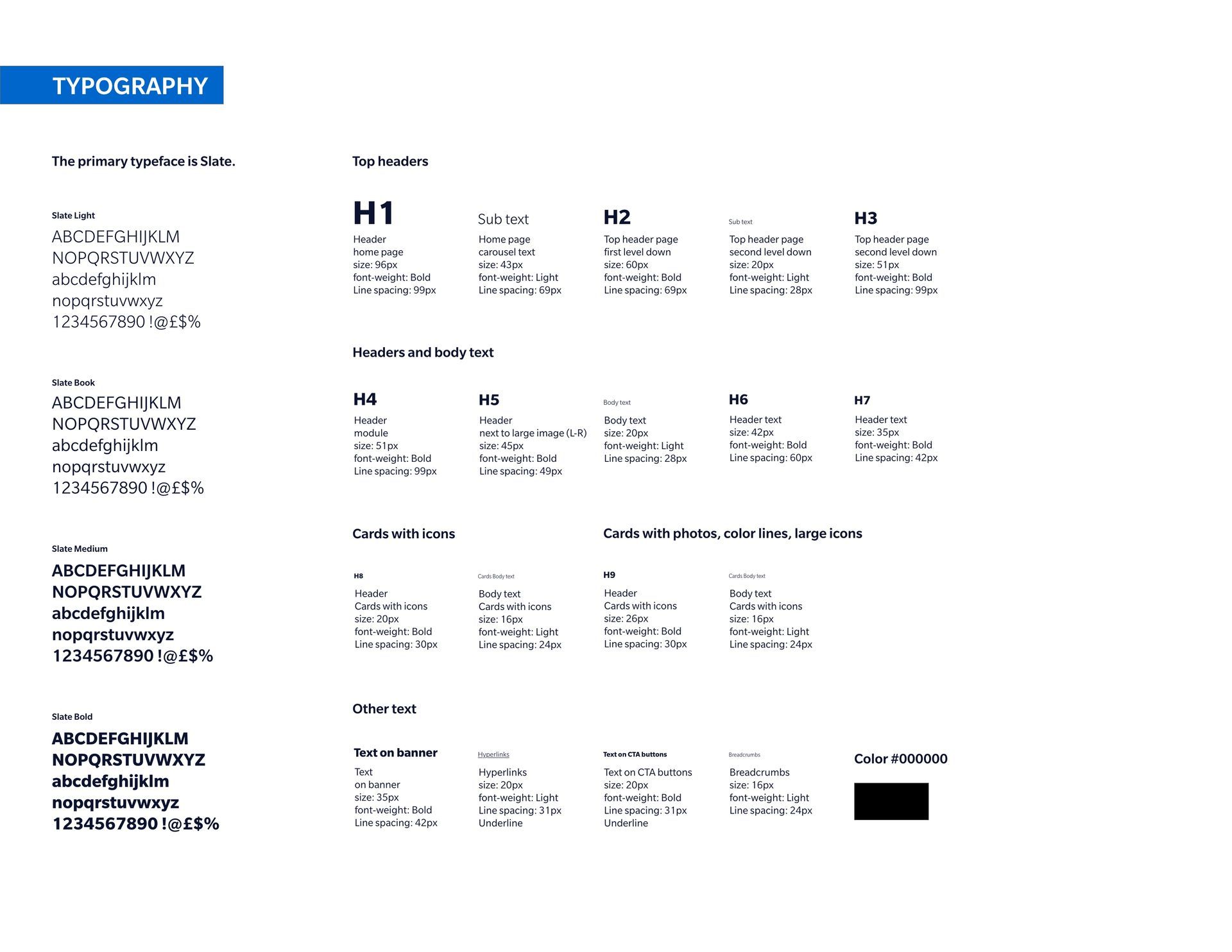
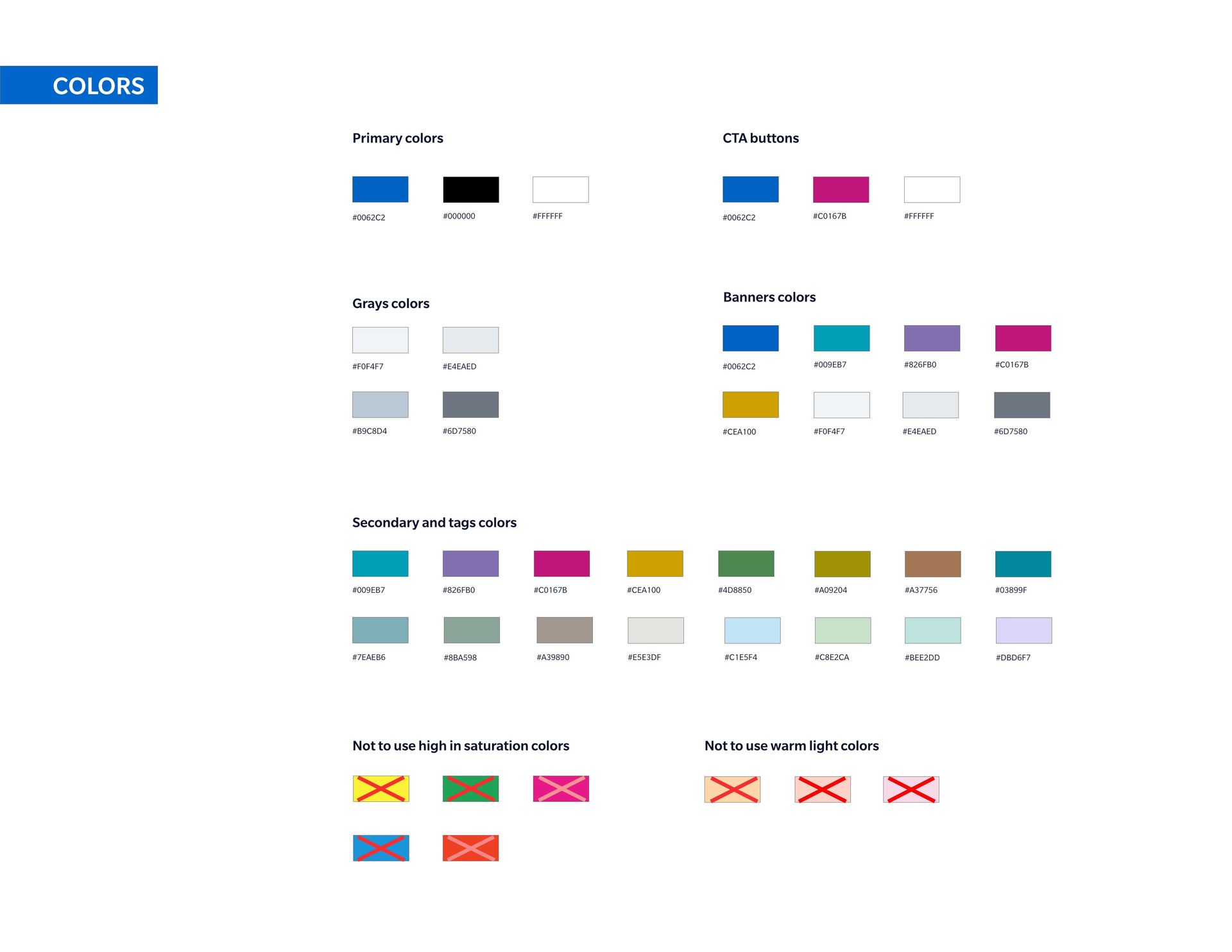
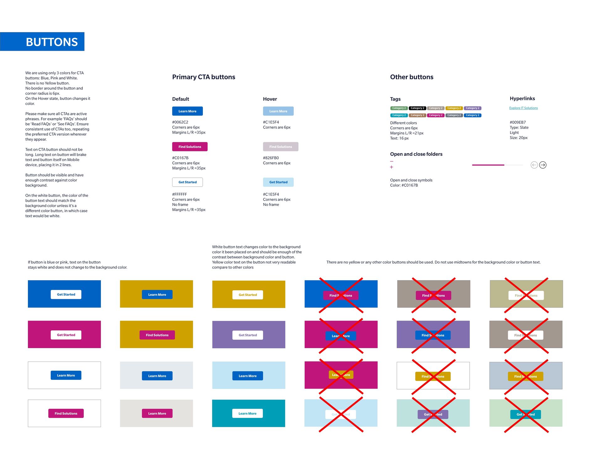
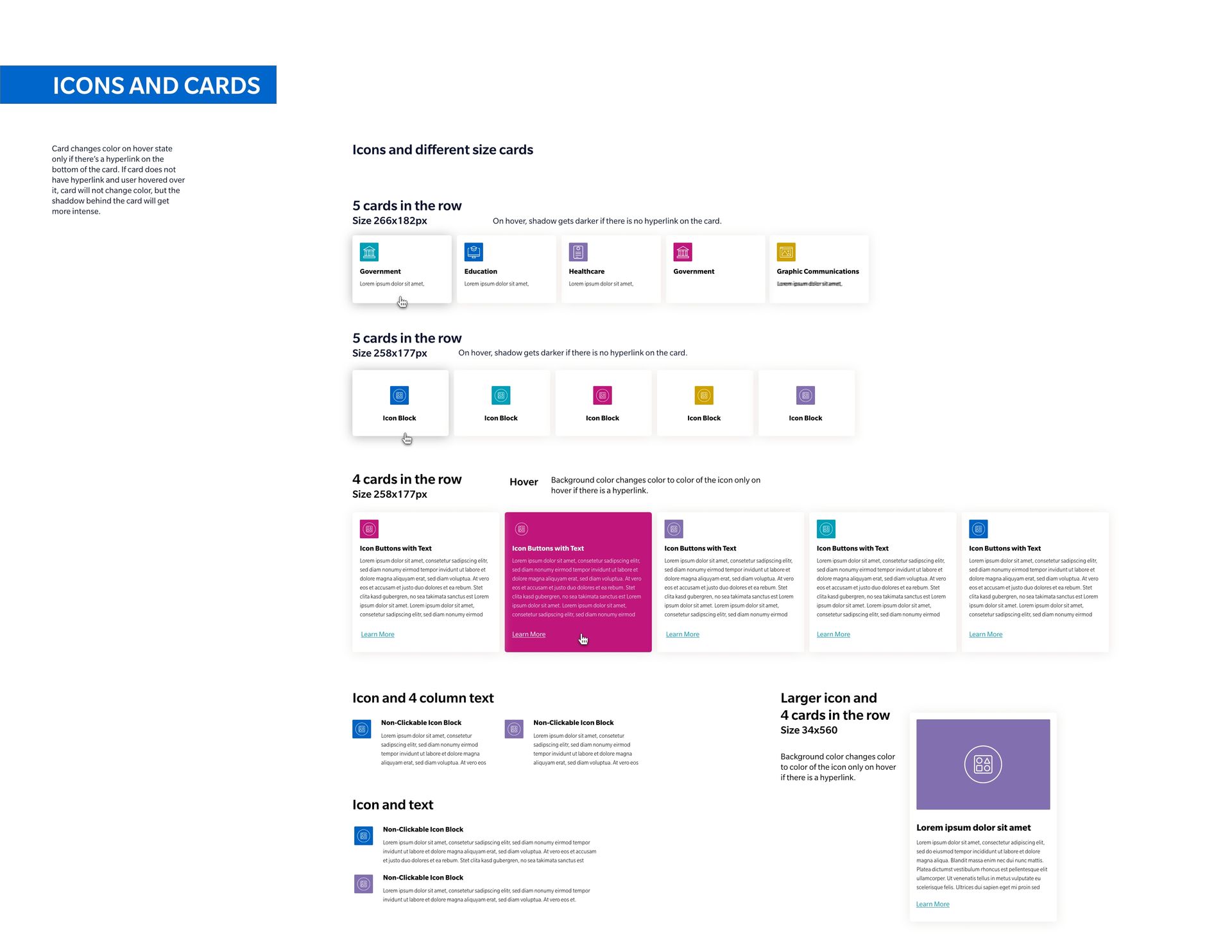
  • Work with company branding and create web style guides.
  • Design Salesforce templates and emails.


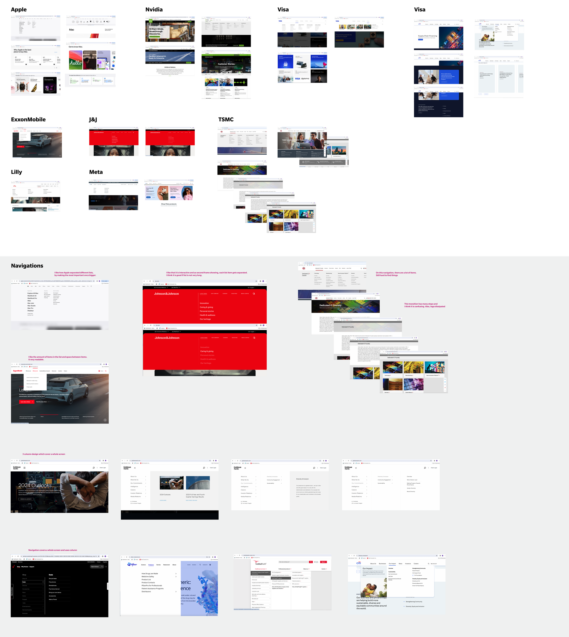
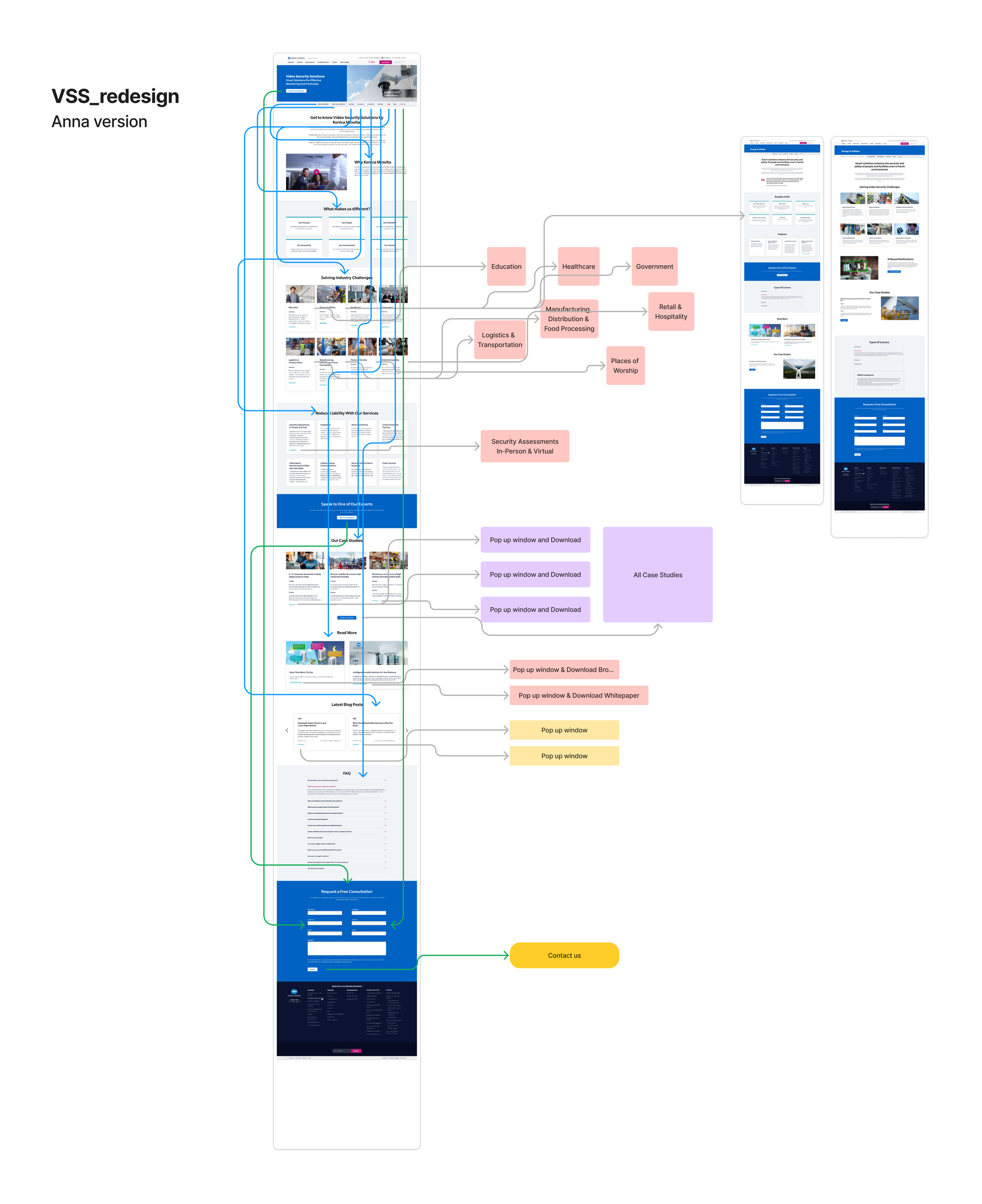
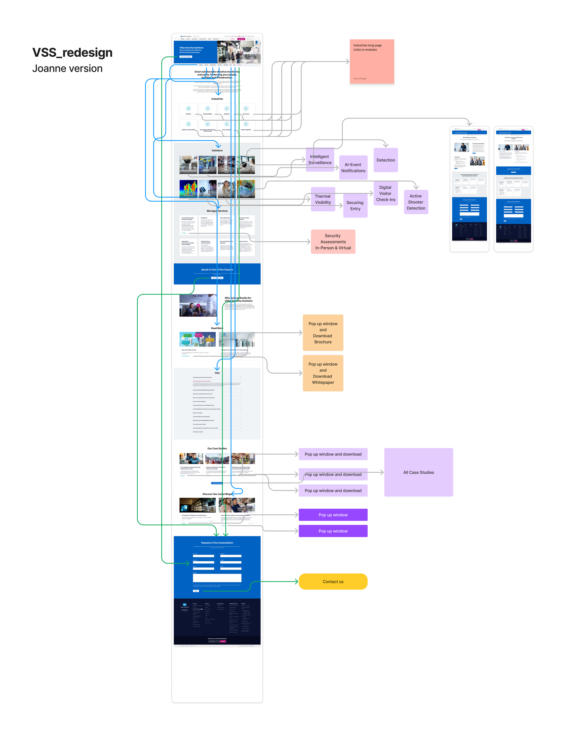
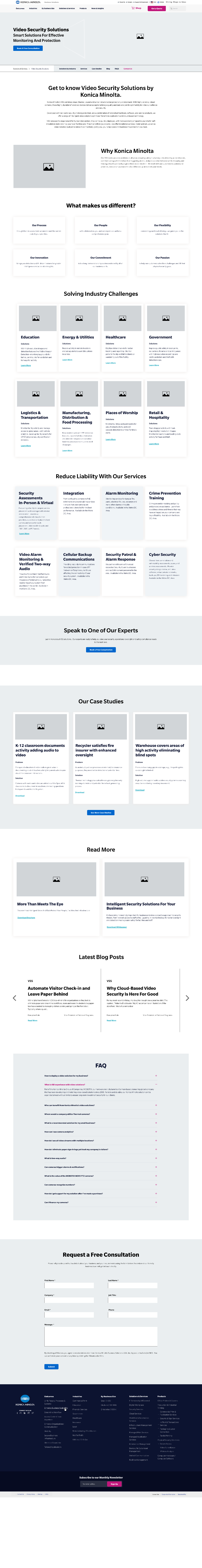
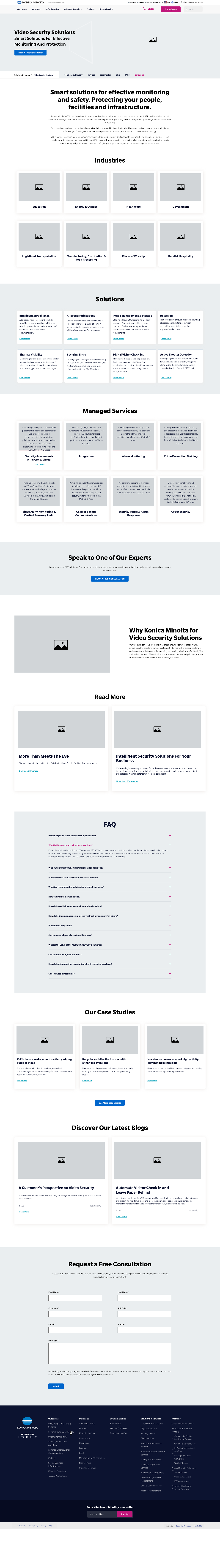
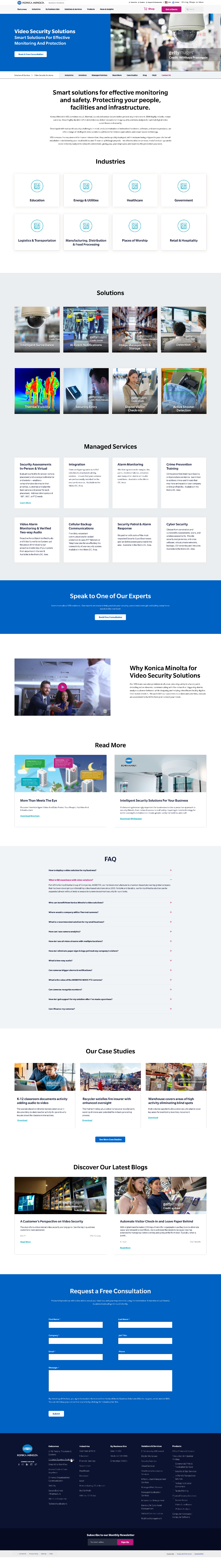
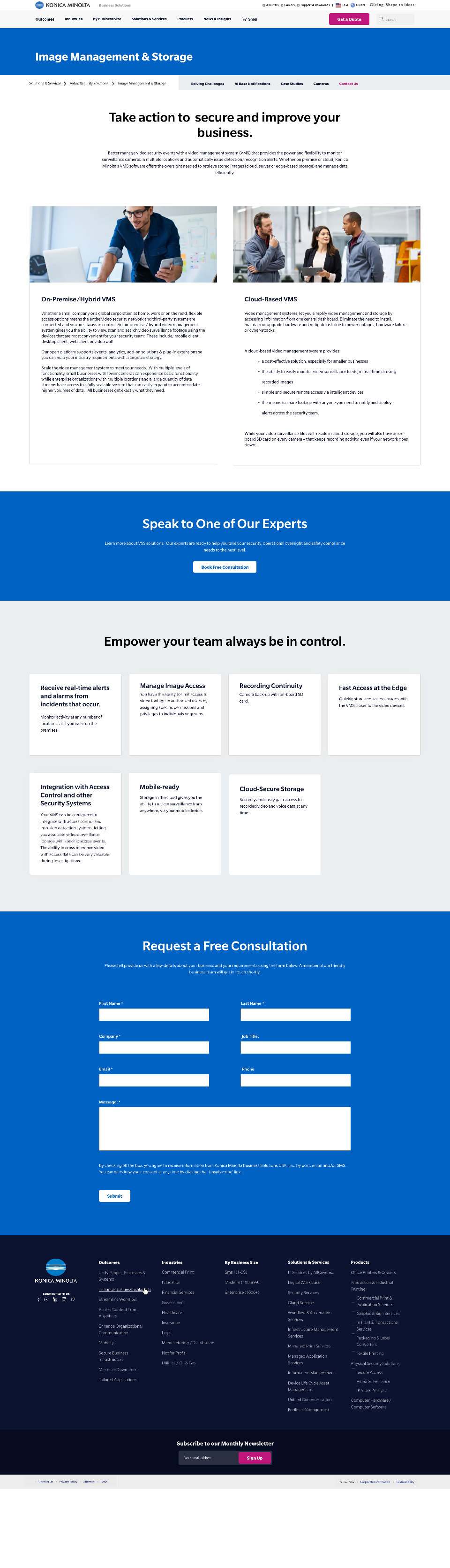
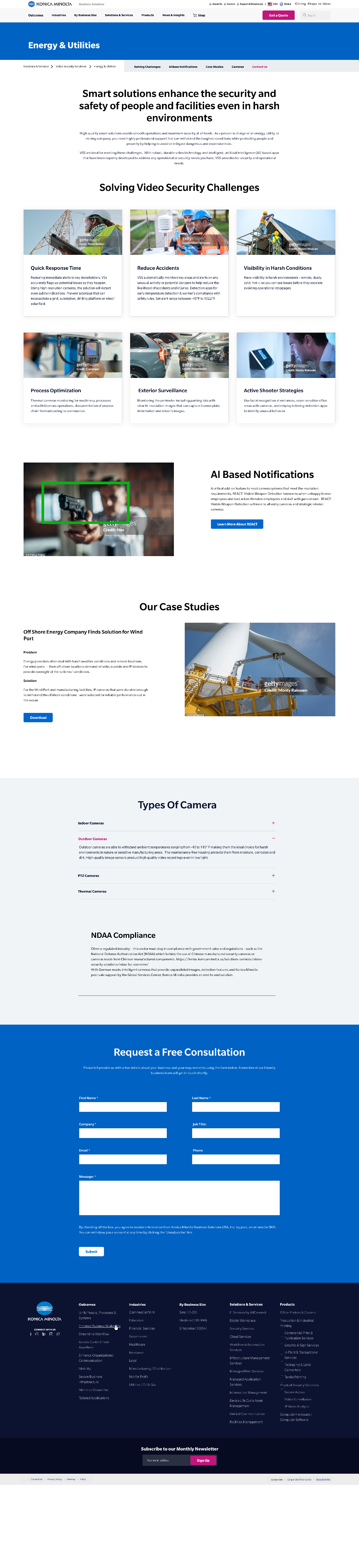
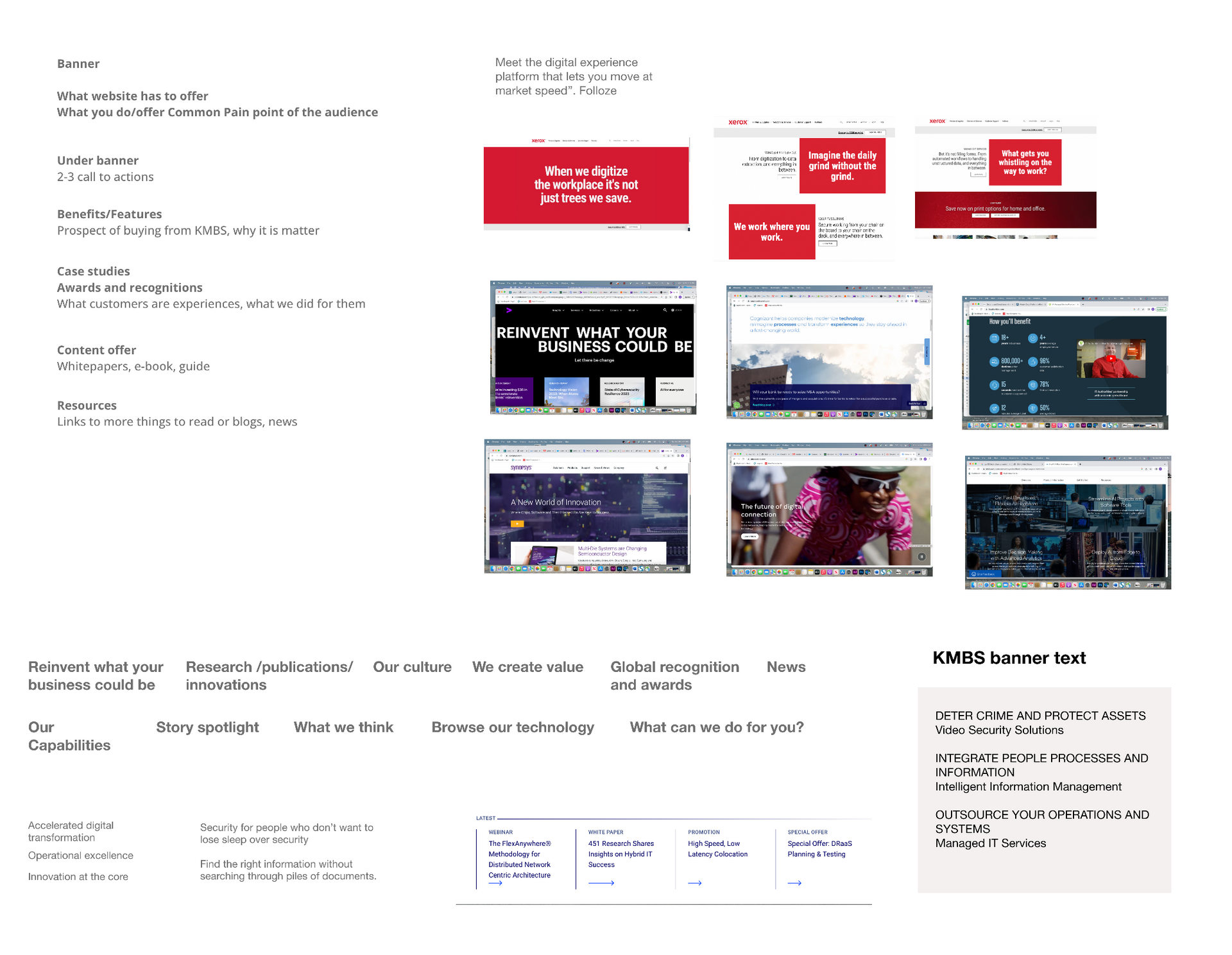
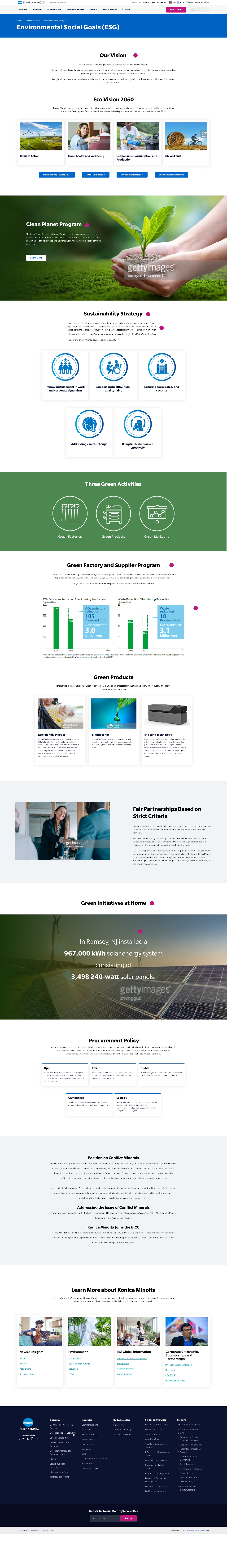
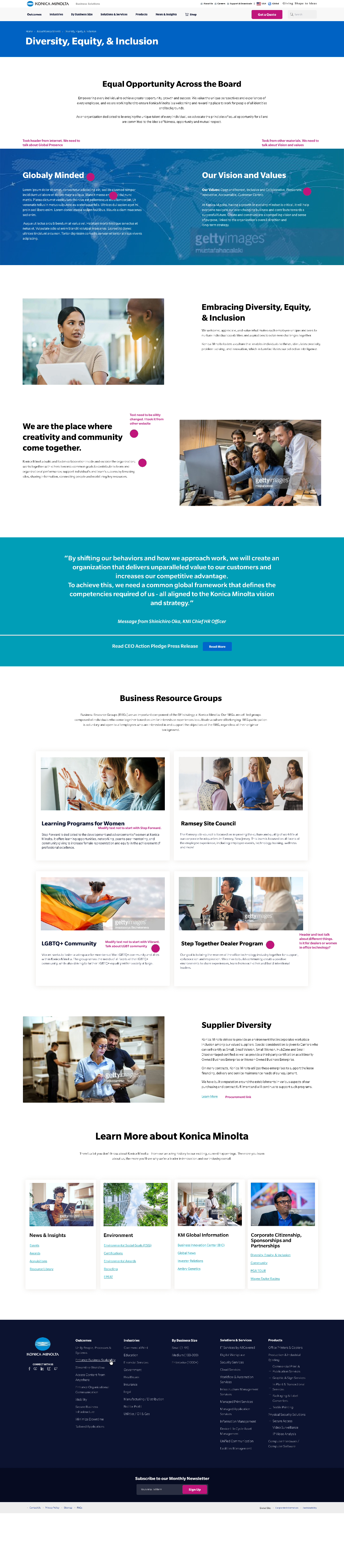
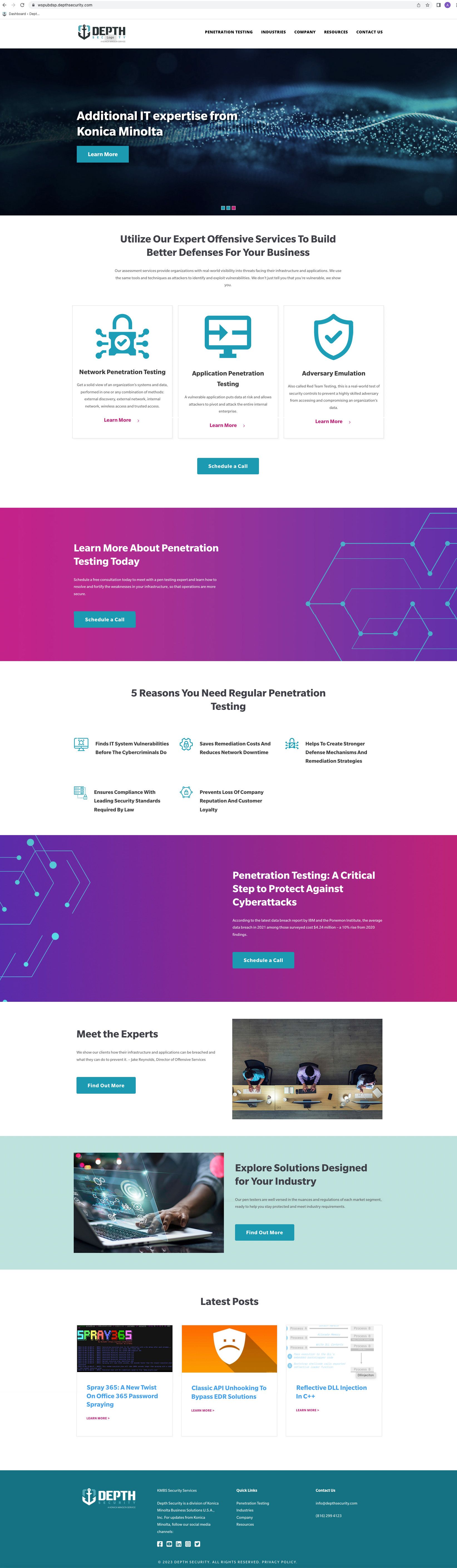
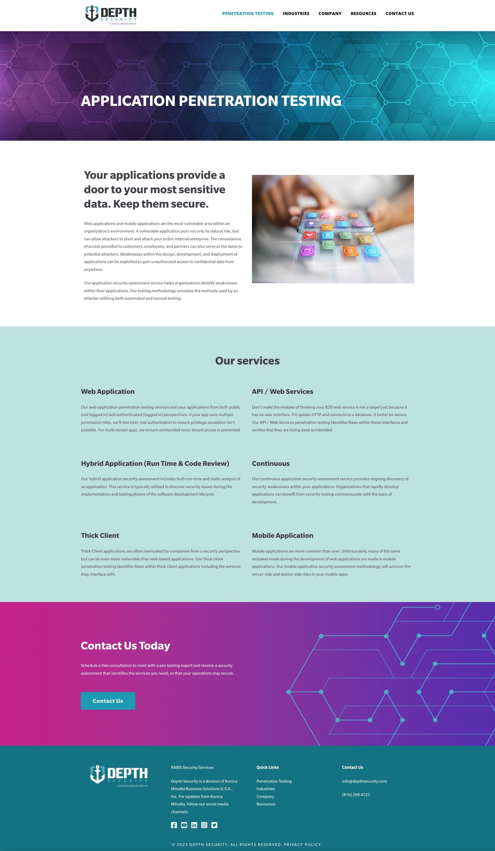
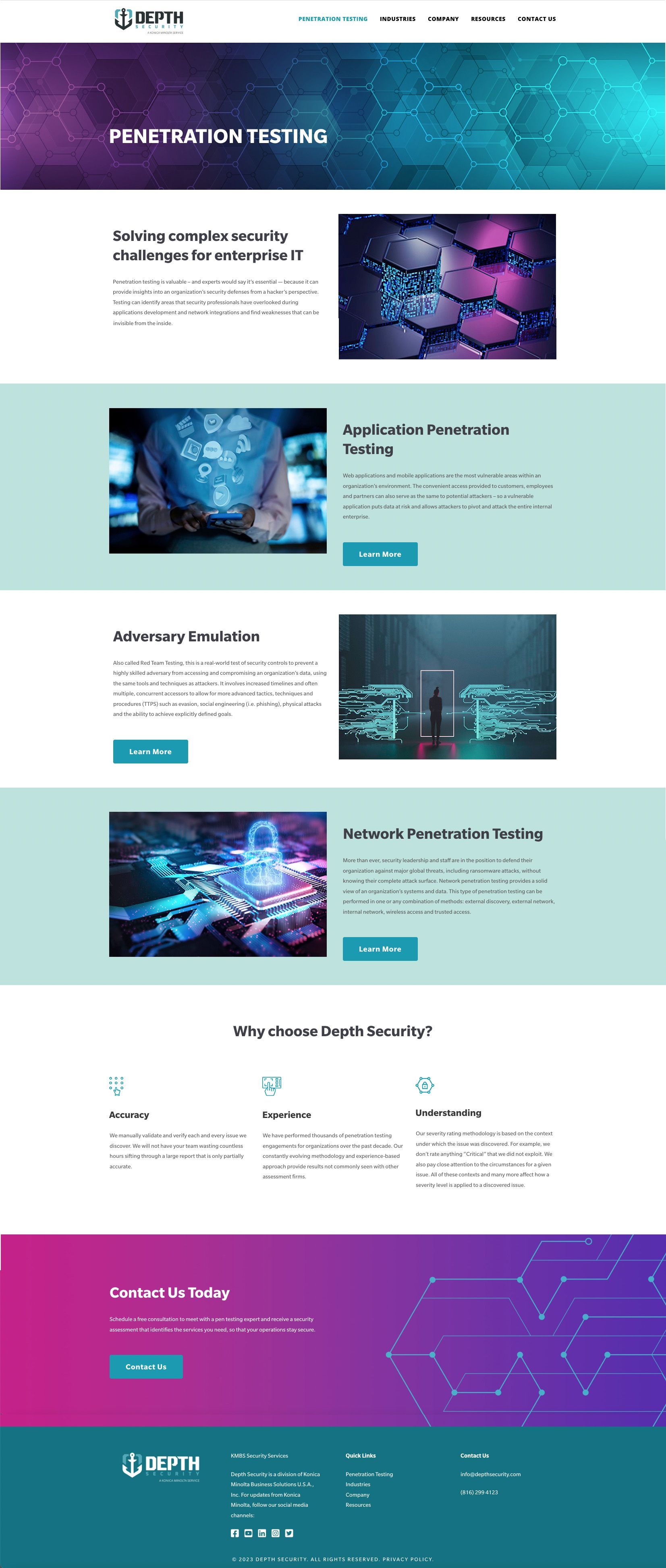
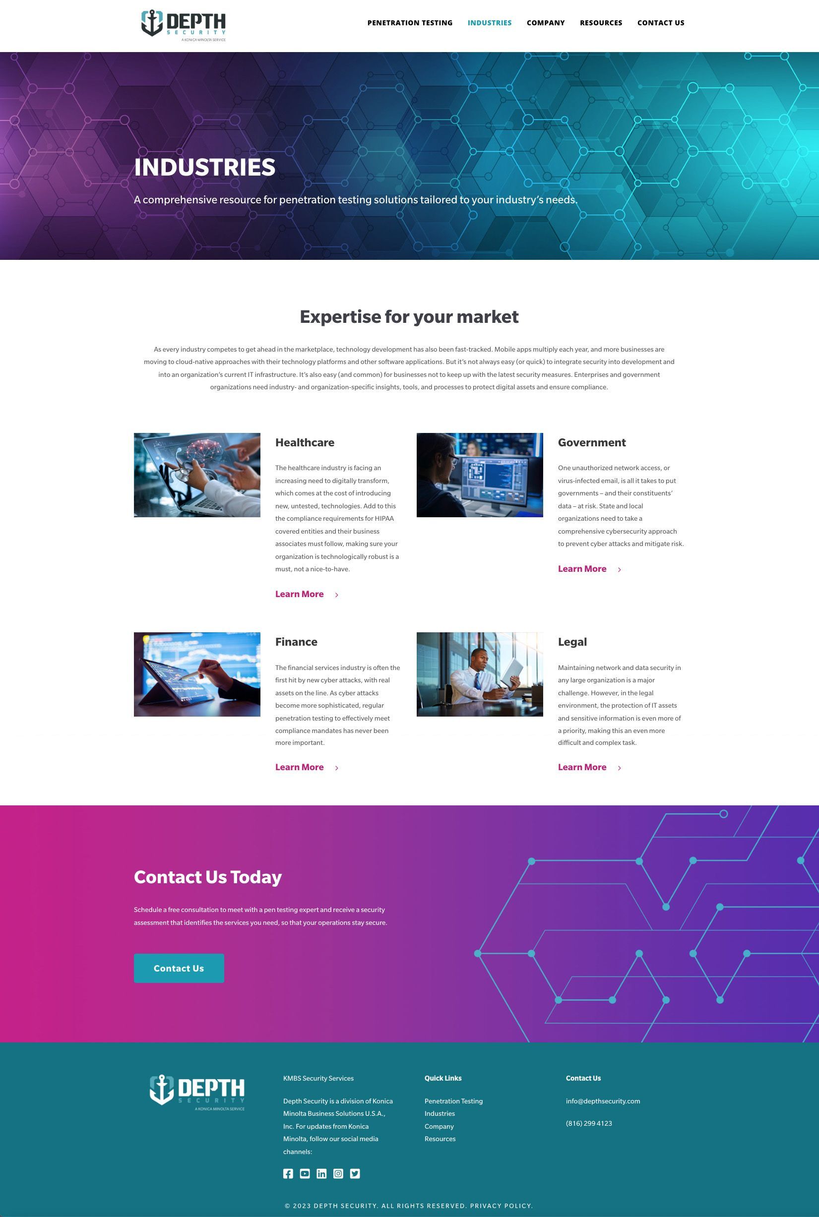
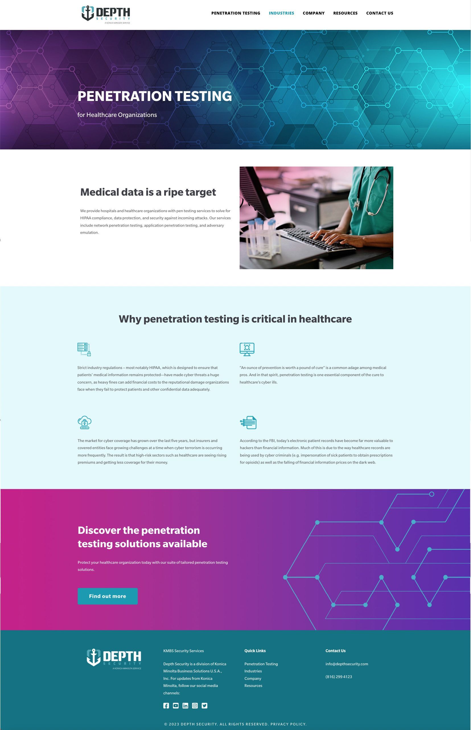
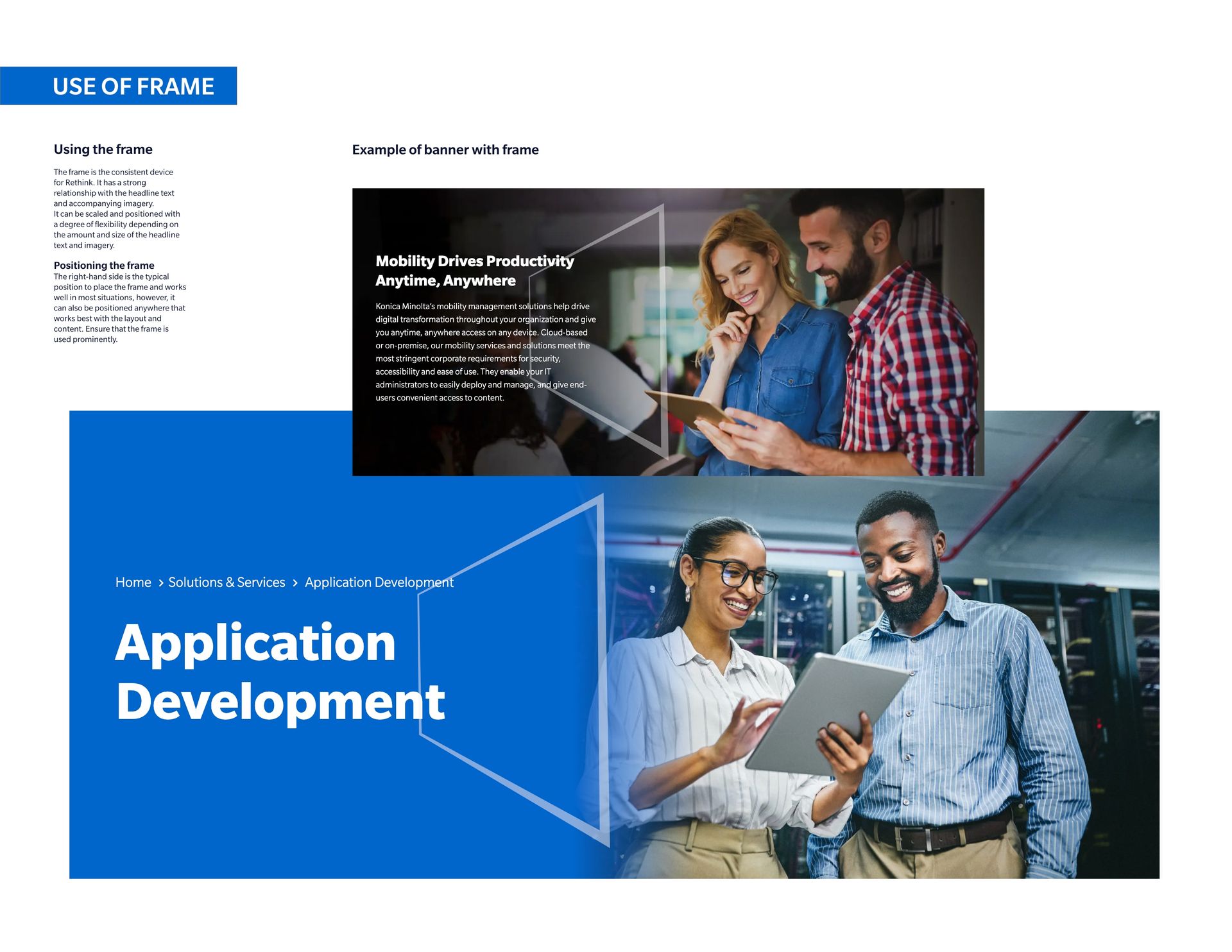
Video security solutions section


Problem:

This section required a redesign to enhance visibility. The existing content was heavily hardware-oriented, so the focus needed to shift towards showcasing the services and technology provided by the company, including AI capabilities.


Solution:

I began by researching other companies to understand the type of information they present on their websites. My goal was to identify content that KM could use to tell our story effectively. I led meetings with the Video Security department to gather information and feedback, and worked with Power Point presentation they provide.

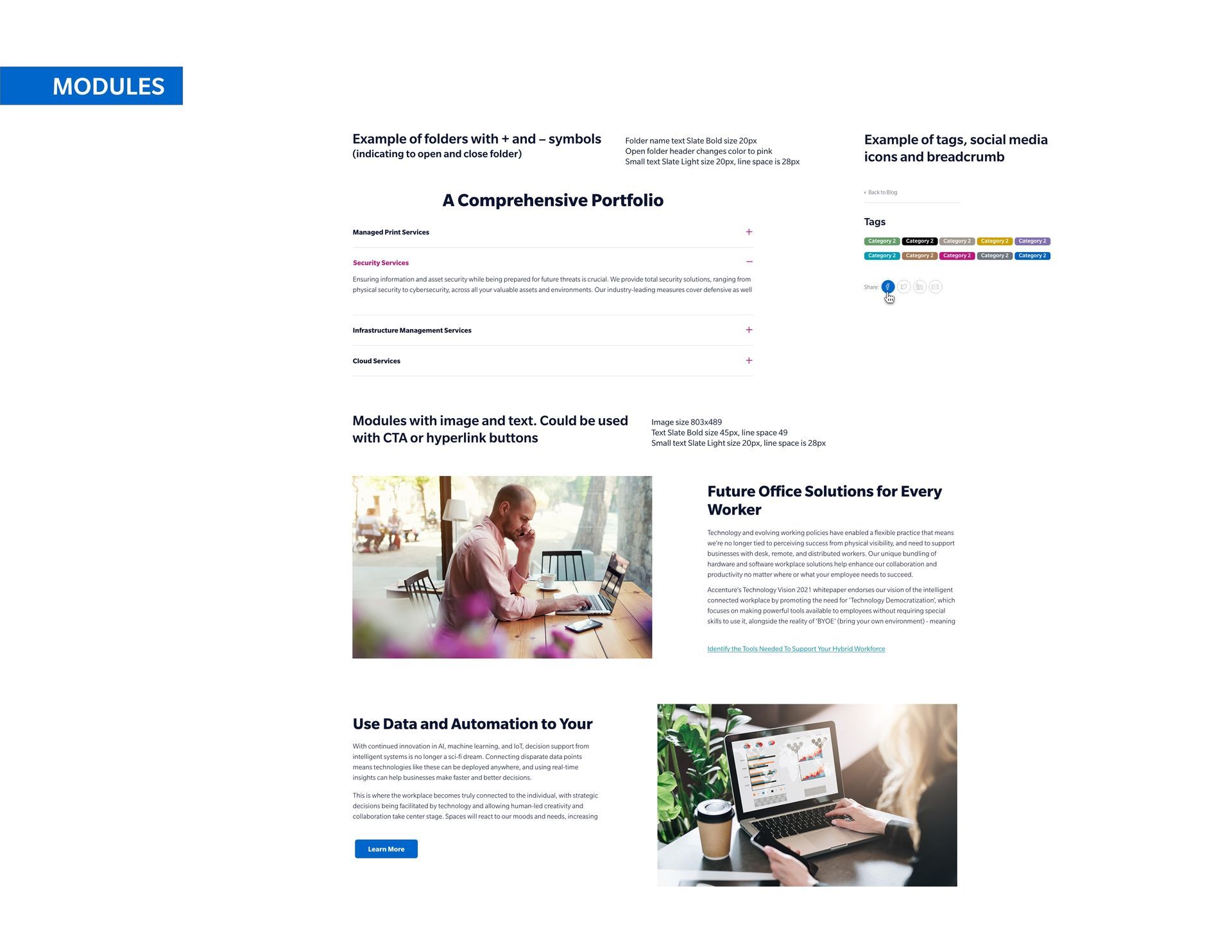
From there, I developed two layout scenarios: one based on stakeholder PP presentation and the other on my own ideas. These layouts included user flow, wireframes, UI layouts, different information modules, and CTA links.

The stakeholders appreciated my ideas, and we decided to merge both versions, resulting in a final, optimized user flow.

About Us section and subpages


Problem:

The "About Us" section was lacking meaningful content that effectively communicated Konica Minolta's values and long-standing history. To address this, I proposed expanding the "About Us" page to include three new subpages: History, Diversity, Equity, & Inclusion, and Environmental Social Goals (ESG).


Solution:

I began by researching other companies to understand how they present their information and structure content. Then, I led meetings with management to gather necessary information and feedback.

Based on this research and input, I developed layouts that included wireframes, UI layouts, annotations, various information modules, and CTA links.

While the stakeholders decided against redesigning the History page, they approved the creation of the two new sections: Diversity, Equity, & Inclusion and Environmental Social Goals (ESG).


This is a paragraph. Writing in paragraphs lets visitors find what they are looking for quickly and easily.

Learn more Learn more

This is a paragraph. Writing in paragraphs lets visitors find what they are looking for quickly and easily.

This is a paragraph. Writing in paragraphs lets visitors find what they are looking for quickly and easily.

Learn more

This is a paragraph. Writing in paragraphs lets visitors find what they are looking for quickly and easily.

Learn more

This is a paragraph. Writing in paragraphs lets visitors find what they are looking for quickly and easily.

Learn more


Name Lastname


Title


Name Lastname


Title


Name Lastname


Title


Depth security website


Problem:

Depth Security, an independent internet security business acquired by Konica Minolta, required a complete website redesign and content update to align with the new brand.


Solution:

I started by learning about Depth Security and the services they provide. I researched other security companies to gather business offerings and content ideas. Additionally, I led meetings with stakeholders to understand their preferences, gather information, and receive feedback.

From this, I developed multiple concepts for the website's look and feel. These included wireframes, UI layouts, various information modules, color schemes and images, created icons.

This is a paragraph. Writing in paragraphs lets visitors find what they are looking for quickly and easily.

Learn more Learn more

This is a paragraph. Writing in paragraphs lets visitors find what they are looking for quickly and easily.

This is a paragraph. Writing in paragraphs lets visitors find what they are looking for quickly and easily.

Learn more

This is a paragraph. Writing in paragraphs lets visitors find what they are looking for quickly and easily.

Learn more

This is a paragraph. Writing in paragraphs lets visitors find what they are looking for quickly and easily.

Learn more


Name Lastname


Title


Name Lastname


Title


Name Lastname


Title


Konica Minolta web style guide


I used the Konica Minolta branding style guide as a base for all design work. However, many of the colors in the guide were more suitable for print than for the web. Recognizing this, I felt the guide lacked a web color palette. Since people view web products on different screens and require various text sizes, a higher contrast is necessary for better readability and to accommodate visually impaired users. Therefore, I adapted the color scheme to ensure the website was accessible and user-friendly.

This is a paragraph. Writing in paragraphs lets visitors find what they are looking for quickly and easily.

Learn more Learn more

This is a paragraph. Writing in paragraphs lets visitors find what they are looking for quickly and easily.

This is a paragraph. Writing in paragraphs lets visitors find what they are looking for quickly and easily.

Learn more

This is a paragraph. Writing in paragraphs lets visitors find what they are looking for quickly and easily.

Learn more

This is a paragraph. Writing in paragraphs lets visitors find what they are looking for quickly and easily.

Learn more


Name Lastname


Title


Name Lastname


Title


Name Lastname


Title